We can use Python Pandas & Mathplotlib libraries to quickly visualise sunrise / sunset timing data, but how to plot time as a number on a graph?
Sunrise / Sunset times are computed on my Arduino Weather Station using SunMoon library ( https://github.com/sfrwmaker/sunMoon ). Incredible that such a tiny 8 bit machine architecture can run this relatively complex algorithm with ease.
Data is logged every 30 mins to daily files stored on SD card in JSON text format.
stevee@ideapad-530S:~/Arduino/projects$ ls  ./data/weather/*.TXT | head -3
./data/weather/20200816.TXT
./data/weather/20200817.TXT
./data/weather/20200818.TXT
Once files are transferred to a Linux computer, a bash script pre-processor (a useful technique on large datasets where syntax modifications are necessary) is used to reformat data as valid array of JSON objects –
stevee@ideapad-530S:~/Arduino/projects$ cat weather_preprocess.bash
#!/bin/bash

for f in data/weather/*.TXT; do
    j="${f%.*}"
    grep "^\[" $f | sed 's/\[//g' | sed 's/\]/,/g' | sed '$ s/.$//' | sed '$ s/.$//'  > $j.json
    sed -i '1 i\\[' $j.json
    echo "]" >> $j.json
    echo $j.json
done
JSON data is an array of objects where each row represents a single log entry indexed by unix timestamp.
Columns represent sensor & computed data – temperature, humidity, air pressure, sun elevation, surise / sunset time and moon phase.
stevee@ideapad-530S:~/Arduino/projects/python$ head -20 ../data/weather/20201015.json
[
{"ts":1602720026,"t":15.5,"h":88,"l":986,"p":102141,"t2":18.8,"a":0.414837,"w":697,"el":-47.86353,"az":2.618189,"lat":50.7192,"lon":-1.8808,"sr":"07:31","ss":"18:14","mn":28},
{"ts":1602720059,"t":15.5,"h":88,"l":988,"p":102140,"t2":18.8,"a":0.166463,"w":692,"el":-47.85925,"az":2.82748,"lat":50.7192,"lon":-1.8808,"sr":"07:31","ss":"18:14","mn":28},
...
Assuming a working Python (v2x) installation and dependencies (Pandas, Mathplorlib, Datetime) are present, we include required libraries and import data from file using Pandas creating a DataFrame in memory table structure –
import os
import json

import matplotlib as mpl
import matplotlib.dates as mdates
import matplotlib.pyplot as plt
import matplotlib.dates as mdates
import pandas as pd
from datetime import datetime as dt

days_to_extract = 90;
path = "../data/weather/"
files = []
frames = []

### Data file path and file format
for (path, dirs, f) in os.walk(path):
    files = [ fi for fi in f if fi.endswith(".json") ]

### Load JSON data
def load_json_data(filepath, frames):
    with open(filepath) as f:
        d = json.load(f)
        df = pd.DataFrame(d)
        frames.append(df)

### process n days datafiles
for f in files:
    filename = path+f
    bits = os.path.splitext(f)
    datestr = bits[0]
    dtm = datetime.strptime(datestr, '%Y%m%d')
    if dtm >= datetime.now()-timedelta(days=days_to_extract):
    load_json_data(filename,frames)

# complete dataset as DataFrame
df = pd.concat(frames)
In dataset although frequency for sunrise / set times is daily, these are actually logged every 30 mins, creating many duplicate entries –
print df['sr'];

datetime
2021-01-19 00:00:26 17:37
2021-01-19 00:00:59 17:37
2021-01-19 00:01:26 17:37
2021-01-19 00:01:59 17:37
2021-01-19 00:02:26 17:37
To get one entry per day sunrise/set timing column data is resampled to daily frequency ( .resample(‘1D’) ) and any null rows are dropped with .dropna().
This is equivilent to a relational database roll-up or group by query.
sr = df['sr'].resample('1D').min().dropna()
ss = df['ss'].resample('1D').min().dropna()
Now we have a single daily time entry row indexed by date.
2021-01-18 17:35
2021-01-19 17:37
2021-01-20 17:38
2021-01-21 17:40
2021-01-22 17:41
Name: ss, Length: 93, dtype: object
To plot times on Y-Axis values from Pandas Series are extracted into a simple 2d array list.
We call datestr2num() from mathplotlib.dates ( converts date/time string to the proleptic Gregorian ordinal ) to format time as a number –
srt = np.array(sr.values.tolist())
srt = mpl.dates.datestr2num(srt)
sst = np.array(ss.values.tolist())
sst = mpl.dates.datestr2num(sst)
giving values that can be plotted –
[737824.30416667 737824.30486111 737824.30625 737824.30763889
737824.30833333 737824.30972222 737824.31111111 737824.31180556
…]
A linear scatter plot can then be rendered with a few formatting options specified
fig = plt.figure()
ax = fig.add_subplot(111)
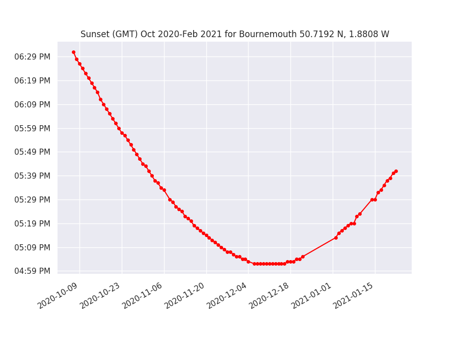
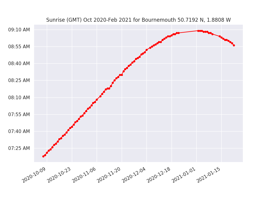
ax.set_title('Sunrise (GMT) Oct 2020-Feb 2021 for Bournemouth 50.7192 N, 1.8808 W')
ax.plot_date(sr.index, srt, '-ok', color='red', markersize=4)
ax.yaxis_date()
ax.yaxis.set_major_formatter(mdates.DateFormatter('%I:%M %p'))
fig.autofmt_xdate()
The result is a curve which shows day light hours being influenced as Mid Winter solstice (shortest day) Dec 21st is passed.
For more info and examples of real time series data charting in Python: https://www.dataquest.io/blog/tutorial-time-series-analysis-with-pandas/
Discussion of Arduino Sunrise / Sunset libraries: http://www.steveio.com/2020/09/03/sunrise-sunset-is-arduino-ahead-of-its-time/